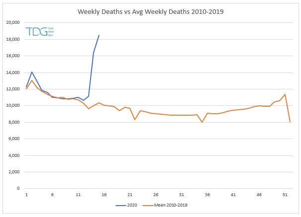
Most articles seem to have focused on the comparison of the weekly number of deaths compared to average so this seemed like a good starting point.
Comparing the latest data to the average of the 2010-2019 gives me the following:
Clearly the last few weeks (week 14 and 15 in government land) have bucked the trend considerably. But, we first need to check whether this is a fair comparison both in terms of trend and distribution.
If we look at the total deaths per year for the same period we get the following chart with a pronounced bump in number from 2015 onwards, so if we use all ten years, we might be creating a lower than expected average - after all, the population is changing both in terms of total people and average age, so we should reflect this by using more recent data.
Next, we can add some upper and lower bounds to get a feel for the data variability - here I've used a 95% confidence to help assess whether the most recent data represents a change, and clearly, now it does. Notice how by using the more recent data we can see the weekly deaths for weeks 3 to 11 were actually lower than normal (Daily Mail please take note, your charts are misleading).
So, clearly we have more deaths than would be expected in a normal year. So how many?
Well some of that comes down to the benchmark that we use. So here is by best (YTD) and worst case (weeks 13-15) scenarios:
The year to date scenario (YTD) looks at where we expect to be by the end of week 15 (week ending April 10th). Following a typical trend the UK would have reached 174K deaths, whereas we observe a figure closer to 185K. This gives an excess of 10,275 which is inline with the government figure at the time (9,288). This figure will not typically include non-hospital deaths (about 17%) and late reporting.
The ONS data for that period is fairly consistent again, however the ONS reporting is based on the date of death, not the date of reporting and these totals change as the deaths are registered retrospectively, so this figure changes from 10,335 reported on April 10th to 13,121 for the same period a week later. This shows no excess deaths other than those that might be expected for delays and non-hospital cases. However, this is a slightly flawed approach in that we are offsetting some of the increases against a lower death rate earlier in the year, which brings me to the second scenario based on just weeks 13-15.
Here we see a potential 15K increase in the weekly deaths compared to the previous five years and running through the same calculations it suggests taht 2K excess deaths for this period when compared to the final stats from the ONS. This means that the daily government figure of 9288 needs to be increased by 42% to attain the final ONS figures of 13121 (which could change again) and 62% too low compared with the potential excess deaths for the same period.
However, whilst in lockdown we may be causing a number of non-covid-19 deaths to occur when people stay indoors instead of obtaining medical help or in delays in getting emergency care. So 62% may be a bit too high. Therefore as a rule of thumb, we should probably take a figure somewhere between 42% and 62% to increase the level of deaths as a broad brush when starting with the daily stats from the government if we want to reflect delays in reporting and non-hospital cases. 50% seems like a good number to me.
Current reported deaths to date are for the UK 18,100 (DoH 22/4/20) this suggests the true figure is probably closer to 27,000. Which is not 41,000 being reported elsewhere,
Going forward we must be careful to not double-count these deaths if changes in reporting occur or catch-up figures are subsequently added in, otherwise we could end up with a huge estimate that bears no relation to reality.


No comments:
Post a Comment