Wednesday, May 20, 2020

A little more interaction

For the last few days I've been looking at ways to incorporate some of the Covid-19 data into a more interactive format for the blog. It's not been easy. Although there are many tools out there, most of them do not work well once you move from the classic simple charts and I've yet to find a tool that can provide the type of charts I like to craft in Excel. So the quest the a decent BI tool continues. 

But by way of a start please see the widget at the top of the blog showing the country growth trajectories created using Tableau. A full page version can be found here. I've had to make a fair few compromises on the layout and I'm not 100% sold on the approach, but it's a start. 

Gains from this approach include interactivity (if somewhat slow) selecting of countries and also the ability to scroll through 5 weekly data points... hopefully the update cycle will also be much improved (tests on other data analyses have been successful so far). One downside if the inability to join the dots of a scatter chart so you have to rely on unpredictable labelling to see what is happening. 

There's also a single country over time analysis available here I would have embedded the dashboard into the blog, but the auto-code generation module in Tableau is unreliable at best (it took hours of fiddling about to get the one in the header to work correctly). So I'm cutting my losses at this time. 

Any feedback on these analyses would be most welcome.

Monday, May 18, 2020

A Quick Global Update

In general the situation around the world is improving every day with the various lockdown strategies having the desired effect and reducing both the over rate of infection (new cases per 100K population) and the rate of growth (measured as Weekly Growth Rate - New Cases).

The high level view looks like the chart below, with a zoomed in version below that.


A large number of countries have moved downwards and to the right since my last update (which is good news) but there are still several causes for concern.

The big outlier in terms of rate of infection is Qatar - the reported data suggests a level over 350 cases per 100K population (I've replaced the value with 200 to avoid compressing the scale too much) and the rate of growth is still significant. Interestingly it's not the only gulf state still in growth with Kuwait, Oman, Bahrain and Saudi Arabia all featuring in the growth segment.

The other notable group is in South America where Brazil continues to grow whilst having a large number of cases in both relative and absolute numbers. However, we can also see Ecuador, Peru and Chile at risk of an ever increasing number of cases which could cause considerable loading of local health resources.

It looks like Russia has hit the plateau of new cases and is just starting to decline and the same can also be said for Sweden.

Other potential dangers areas with low current cases but a high rate of growth are South Africa, Argentina, Bangladesh and Columbia - hopefully these will not experience rapid rates of growth, but could be concerns over the coming weeks.

As an experiment, I've put some of the data from the analysis above into a new mapping widget (see below). Here we see the rate of new cases per 100K population with the countries coloured in accordingly. I have to say that although there are quite a few issues with the widget, the overall map is not too bad in identifying some of the clusters mentioned above with the Gulf States and South America clearly drawn out. I just wish I had more control over the colouration, scaling and positioning to draw the map I really want to. Oh, well, the search for better mapping tools continues...


Friday, May 15, 2020

Update on Excess Deaths England and Wales (week 18)

Using the latest data from the ONS (which covers week 18 - the week ending May 1st), we get the following pattern for weekly deaths in England and Wales.

Following on from the previous post on this subject, the top line numbers are starting to fall (as would be expected from the regular daily briefings), but weekly numbers are still considerably above historical trend. In the latest week there were just over 8,000 more deaths than might typically be expected.


Looking at the various measures of Covid-19 reporting gives the picture below. There are over 46 thousand more deaths in recent weeks than might normally be expected (please bear in mind this data has a near two-week lag, so several thousand more deaths will have occurred during the lag period).

The ONS are reporting just over 35 thousand deaths due to Covid-19, which I expect to increase to over 36 thousand once reporting catches up. This leaves about ten thousand deaths unaccounted for - which is my worst case estimate for additional Covid-19 deaths during this time.   


Over time the percentage difference between the ONS reporting and the final figure reported weeks later (which I estimate as the ONS Forecast figure) will reduce, since more of the numbers become locked in and the overall death rate starts to fall. We are almost at the point when such adjustments become meaningless, so this may be the last week that I include this in the reporting - I will track the variance over time and see whether the impact is large enough to merit it's ongoing inclusion.

Thursday, May 14, 2020

Update on the US

Please find below the latest trajectory analysis for the US by state. The situation is now looking far more favourable that a week ago, with the majority of the states having moved to the right of the y-axis denoting a decreasing number of new cases. This means that there is a net reduction in the total number of new cases and, barring and major changes in behaviour, should lead to faster levels of decreasing cases nationally as more states start to decline and are no longer offset by increasing case numbers elsewhere. 


Some areas of concern remain with South Dakota, Minnesota and Delaware still growing on a higher than average rate of infection (i.e. new cases per 100K population) and Rhode Island and District of Columbia (D.C) having very high levels of infection around the point of plateau.

California is also of interest - last week the level of new cases was falling, but more recently new cases have started to grow. On a per capita basis this is still fairly low, but the sheer size of local population means that should the infection run out of control case numbers could get very high very quickly. I shall watch this closely over the coming weeks.


Tuesday, May 12, 2020

Update EU 5 and USA

UK:

The number of new Pillar 1 cases continues to fall, as does the daily levels of fatalities - in fact the fatality rate has fallen slightly (relative to new cases) in the last week or so. But we are still seeing 2000 new cases each day, which is a concern since only slight changes in behaviour could see these numbers start to climb again. This higher level of new cases can be seen on the cumulative chart on the left - notice how the line is still growing at a reasonable rate (although no longer straight), compare that shape with France where the equivalent line is much flatter. 


If the trend continues expect daily deaths to stay at about 300 per day (on weekdays) and the Pillar 1 total deaths to reach 28,000 in about a week.


France:

The rate of new daily cases is generally low, with occasional spikes. We are regularly seeing less than a thousand new cases a day, but the short term trend is effectively flat (reminds me of South Korea which ran on stubbornly with a token amount for weeks and weeks). 

The rate of daily deaths have increased of late and have been nearly twice the previous level (based on my lag probability model). Not sure if this indicates a change in the situation of a catch-up in the reporting of earlier deaths.


Expect very similar numbers in the short term with an daily average in the high two-hundreds and a cumulative value approaching 28,000 in a weeks time.


Germany:

Despite some sensationalist reporting in the press, the data from Germany is on a steady downward trend (once the impact of weekend cycles is taken into account).


The overall rate of death determined by my lag-probability model has increased in Germany (but not by as much as in France), but still the overall reported figures are low. I'm still not convinced as to how reflective these numbers are for Germany - but since I cannot find any equivalent to the ONS weekly deaths statistics for Germany comparing 2020 with previous years, that will have to remain a mystery for now.

Expect 50-90 deaths per day to be reported for the next week, bringing the total to over 8,000 by the end of the week.


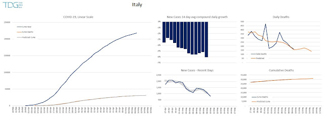
Italy:

The rate of new cases is still declining steadily (now averaging a decrease of 6% per day). but as we can see in the UK, there is still some way to go with over 1000 new cases on most days in the last week.

The rate of daily deaths are following the model's predictions fairly closely, so a very predictable short term pattern appears to be emerging.


Expect daily deaths to average about 160 per day for the next week, bringing the cumulative total up 31,000.


Spain:

The number of daily new cases in Spain refuses to drop at a regular rate. Although the long term trend is downwards there have been several week long periods where the rate of new cases has been steady, and Spain appears to be in another one of these steady-periods at the moment. Hopefully, this is just a precursor to another drop in new cases in the next few days.


Expect daily deaths to average 200 per day for the immediate future with total reported deaths approaching 28,000 in about a week.


USA:

I think this is the first time I've been able to look at the US data and say with any confidence that the rate of new cases is actually decreasing. We've had some wobbles and flat-spots in the data, but now we can see a 2 to 3 week trend where the numbers are really going down. In fact I'm looking forward to updating the data by US state to see how many of the states that previously had growing rates of new cases are now flat and/or in decline.

However, despite the improvement in trend, the underlying numbers are huge with nearly 1.4 million reported cases, although many of these are milder cases than reported elsewhere, leading to a correspondingly lower rate of death (rate of death per new case after time-lag is included is approximately half that of the UK).

Now that (hopefully) many more US states are seeing declining number of new cases, in the coming weeks we should really start to see the rate of decrease start to change (upper middle chart) from the -2% value we have now to something approaching -8%, at which point the US will have really turned the corner.


Expect daily deaths to average 1700 in the next week, with total deaths approaching 90,000 by the end of the week. At the present rate a quick forecast suggests the US will record its 100,000th death on or about May 22nd, but I suspect there may well be some deceleration in the rate over the coming weeks which could push this milestone back a few days. 


Post -Plateau Trends:

And finally, an update on the rate of new cases comparison for Italy, Spain and the UK. Generally we see the same trends emerging with slightly different localised rates. The periodic waves in the data are caused by lower weekend reporting (I'm working on an adjustment for this), so it's best to look at the underlying trends.