Thursday, April 30, 2020

UK update 30th April 2020


UK:

Please find below the updated dashboard for the UK for Pillar 1. This includes an updated forecast model for daily deaths that includes a factor for weekly periodicity (aka v2). More details on the methodology can be found in the previous blog entry.


The last few days have seen a marked decline in the number of new cases for Pillar 1 with yesterday's figure being the first below 2000 whilst in decline and is less than half the peak values being reported a few week ago.

The rate of decline shows some evidence of actual accelerating, but in real terms it is probably too early to tell. Also, I would not be surprised if a proportion of the Pillar 2 cases start to move into Pillar 1 soon, so that may drive a small increase or flat spot in the short term.

Daily deaths are expected to stay around the 600 per day mark for the rest of the week, with a drop down closer to 300 for the weekend figures (reported on Sunday and Monday).

Total hospital deaths will approach the 25,000 mark by May 4th.

In terms of the rate of decreasing new cases (see chart below), Italy, Spain and the UK (Pillar 1) are on very similar trajectories. Both Italy and Spain show periodic weekly uplifts in new cases, which do not appear to be so pronounced in the UK - let us hope the UK trend continues its downward pattern for the next few days.


The number of New Daily Pillar 1 cases is the key metric in understanding the Covid-19 situation in the UK- this is the leading indicator we all need to be tracking. 


Periodicity in UK Daily Deaths

When looking at the number of hospital-based deaths reported in the government briefing each night, it's not difficult to see a degree of periodicity. See the chart below (recycled from yesterday). Here we can observe a semi-regular pattern of five relatively higher days compared to two lower ones, these values, of course, correspond to the reporting of weekday and weekend fatalities. The obvious questions then being, can we build this into our forecast and will it improve accuracy?


The first step then, it to look more closely at the data to see if a pattern emerges. Here we again can use the centred moving average (CMA) that I covered yesterday to benchmark each day's value to create a relative size index.

So our index for each day is defined as : (daily deaths on date=t ) / (CMA on date=t)

Take the values created and then place them in a table as below. Each value represents whether a particular day is higher or lower than expected, with 1.00 meaning the value was as expected, 1.1 was 10% higher, 0.90 was 10% lower etc.

Then by looking along each row we can see if the numbers reported on a particular day of the week are often similar values which would suggest an underlying cyclic pattern exists.


At this point the process includes a little bit of judgement rather than blind process, since it is often valuable to inspect these values to see if there are any changes over time or outliers that we need to address.

Firstly the week beginning 16th March looks very different to the later weeks, so I will exclude this from my average calculation. Secondly, March 25th was very low at 0.37 caused by a change in the reporting process, so I have excluded this value along with March 30th which was low at 0.54. The remaining values look reasonable and consistent giving the mean values in the last but one column. The final column shows the standard deviation of the weekly values for each day - the lower this number the more consistent the values are, at the moment Friday is the most consistent with Monday the least, but overall I am pleased with the results obtained and demonstrate a clear periodicity in the data. 

The values in the 5 week means column indicate that on average the values reported on a Monday are only 0.75 times the underlying trend, whereas on a Saturday the reported numbers are 1.21 times higher than the trend.

So if we used these multipliers to modify our original prediction for daily deaths will the results be better? The chart below, showing the actual numbers against the two predictions looks better, but we should really evaluate this properly.


The temptation at this point might be to pick a single approach, generate a metric and make a decision, but there are several metrics we could choose with their own strengths and weaknesses. For the sake of a few extra minutes, why not run a few different ones and see if a consensus emerges?


The first metric is a simple correlation (function CORREL() in Excel) between actual and prediction (known as r). The correlation values is often more useful than the more commonly used r-squared measure, since it also tells us about the direction of correlation than just the match. The closer to +1 or -1 you get the better the correlation. For this metric the newer method is more accurate. 

R-squared is simply the value of r, as above, but squared (function RSQ() in Excel). This again shows that the new method is better.

MAE is Mean Absolute Error so measures the average absolute distance between prediction and actual value. The absolute part stops negative errors offsetting positive ones. The lower the value, the better, and the new method wins again. 

MSE is Mean Square Error. Similar to the method above, but the error (the distance between prediction and actual) is squared. This has the effect of placing a higher weight on big errors, so an error of 10 counts one hundred times more than an error of 1. This is a common approach to use and the concept of squaring the error is indirectly included in other metrics like correlation and r-squared. The lower the value of MSE the better - the new approach wins again. 

MAPE is Mean Absolute Percentage Error. This is useful if the data has a wide range of values - our sample is not too bad in this respect - this method prevents small percentage errors on large values from distorting the measure of accuracy. Again, lower is better and the new method wins again. 

Last but not least is MSPE - Mean Squared Percentage Error - like MAPE but penalising higher percentage errors more than small ones. Low values indicate a better forecast, so again the new method wins. 

So with six out of six metrics showing that adding these weekly weights to the daily death predictions for the UK, it clearly shows this approach is more accurate. I have therefore implemented the newer approach in the UK dashboard and will evaluate for other markets moving forward. 


Wednesday, April 29, 2020

Update on Weekly Death Rates in the England and Wales

The latest data pertaining to weekly deaths in England and Wales has now been published by the ONS here

So here are my updated views of the top-line numbers:


The latest weekly figures, not surprisingly are well in excess of the average of the previous five year with the latest published week (week 16, w/e April 17th) recorded as 22,351 vs a five-year average of 10,547. You don't need to be a statistician to see that figure is considerably different to the normally observed values. 

To put the numbers into context I have updated the two scenario from last week - based on year to date (YTD) and by direct comparison to the later 4 week period (weeks 13 to 16). By direct comparison this suggests there have been between 22,135 and 26,959 (C) more deaths than would be normally expected. 

The daily government briefings on Covid-19 deaths in hospitals (D) explains over half of this increase, and the non-hospital Covid-19 deaths from the ONS (G) explains a further 4,313 (22.5% of reported Covid-19 deaths), leaving somewhere between 3,042 and 7,866 (J) deaths unexplained. 

These additional deaths are likely to be a combination of Covid-19 and lockdown related non-Covid-19 cases - at this point this is probably running in the region of 5,500 excess deaths in total based on the mid-point of the two scenarios below. This estimates the true death-toll from Covid-19 at week 17 in England and Wales in the region of 5,000 more than the ONS figures given a total of about 24,000. 

Notice that the final ONS hospital figure (F) is very close to the Government reported figure at the time (D) so has only increased slightly as delayed reporting has been logged, this suggests the daily briefing figures can be viewed with a fair degree of confidence when looking at the absolute levels and trend going forward. 

Bad Practice


For a while, the daily briefings in the UK have included the chart below (source here). More recently it has also included a 7-day rolling average as an additional line. In fast changing times this is very bad practice because there is a systematic lag between the pattern in the daily data and the pattern in the rolling 7-day period. Notice how the bar chart seems to reach a natural peak about 4 days before the line - this is misleading.


Whilst this might be acceptable in data that does not change too much (such as steady monthly sales data being rolled up into a Monthly Annual Total, aka an MAT,  a very common practice in the pharma industry) it doesn't work well for fast changing data like the example above.

It is much better to use a smoothing approach centred around each data point. On my Covid-19 dashboards I typically use a three-point smoothing, which makes it easy to spot the trend, but given the strong 7-day periodicity of the data (more on this another time) it makes sense to smooth over 7 days, that way you always have one each of both the higher days (Saturday is usually the highest day) and the lower days (Monday is usually the lowest) in the calculation making it easier to tease out the underlying trend.

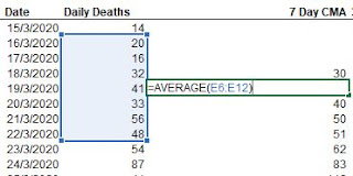
The approach, often called a centred moving average (CMA) is simply an average of each day calculated based on the day itself, the 3 days before and the 3 days afterwards. In excel the calculation looks like this:


Applying this to the data above gives me the following chart:


Notice now how the line follows the pattern of the data rather than the government version which lags behind. See also how much easier it is to work out when the number of fatalities peaked in the UK (about April 10th). Looking closer you can also see how the weekend dips in the data have been almost eliminated and a smooth underlying trend has emerged.  

In reality, this is exactly the same curve as obtained using the government reported rolling seven day approach, but it's been shunted back by three days, but see how much more useful it is now. 

The only downside of this approach is that it cannot be consistently applied to the first few and last few points where you do not have the full seven values to average over - you can extend the formula in the spreadsheet by all means, but you bias the sample to the points you include, the very last thing you want to do in a fast changing situation. However, it's not usually too difficult to mentally adjust for this and, as in the example above, see that the trend is probably continuing downwards. 

As you can now see a CMA-type smoothing is much better than a rolling 7 day number in these circumstances. The next time I see Boris I will let him know.

Monday, April 27, 2020

Latest Dashboards - Top 5 and USA

UK:

For reasons previously stated, I've switched reporting of the UK over to Pillar 1 cases only, since this is both consistent and insightful - including Pillar 2 just muddies the waters.

The rate of new cases continue to decline in a fairly linear fashion with plenty of lumps and bumps along the way. The same can be said of the daily death rates - we are in the middle of receiving the data for the weekend, so do not read anything into the most recent dips, Sunday and Monday figures are always low.

Going forward daily deaths should stay in the 500-600 range this week so expect total fatalities to be about 23,000 by the end of the week.


France:

This is still difficult to model and analyse due to the large spike in cases reporting on April 16th, but overall the trend looks very good. New cases are declining quickly compared to peak values and appear to be about half the level they were 7 days ago (although weekend dips make comparisons difficult). Daily fatality rates are also much improved and should average about 200 per day for most of the coming week.

Cumulative deaths are showing signs of slowing (seen as a downward curve on the lower right chart as opposed to a straight line). Expect total deaths to be about 24,000 by the end of the week.


Italy:

The data for Italy is showing a steady if somewhat erratic decline in both new daily cases and daily deaths, with the rate of new cases falling by 50% in just over two weeks. There is a pronounced weekly pattern to the data (caused by weekends) which is also seen in other countries, so it is better to look at the longer term trends than individual points, but overall the picture is looking much better.

Expect daily deaths to stay in the 300-400 range this week, with total deaths reaching about 28,000 by the end of the week. 


Spain:

After a period of decline, new daily cases in Spain seem to have flattened off in the last few weeks, so expect daily deaths to follow the same pattern. Expect about 400 deaths per day for the next week, giving a cumulative total of nearly 25,000 by the end of the week.


Germany:

Daily figures for both new cases and deaths are in sharp decline (allowing for weekend dips) with the rate of daily deaths expected to be around the 100 per day point by the end of the week.

Cumulative deaths should approach 6500 by the end of the week. Note: Germany's classification of Covid-19 deaths could well be different to other countries, so direct comparison is discouraged. We await total weekly death statistics (any cause) from Germany with interest.


USA:

New cases in the USA are still very much in the plateau phase having been around the 30,000 new cases per day since April 6th, with a couple of recent higher days on April 24th and 25th. This is quite long for a plateau, but given the large number of population centres in the USA, it may just reflect many localised curves with shorter plateaus overlapping in a slightly offset pattern. I hope to see some evidence of declining cases soon, or at least a decline in the daily death rates that might reflect early pick-up of milder new cases.

For the time being expect daily deaths to remain in the 2000-2500 per day range for some time with cumulative deaths reaching 66,000 by the end of the week.


Friday, April 24, 2020

UK update with Pillar 1 data only

For the past few days I've been wrestling with the model for the UK, in particular why are does the top line data for the number of new cases still stay in a plateau when the daily death rate falling?

I think I have the answer... it's the Pillar 2 numbers (thanks to MH for being my sounding board on this). By including Pillar 2 we are muddying the water considerably as we mix apples and oranges. Let me explain...

Pillar 1 are (give or take) a reflection of positive Covid-19 cases on admission to hospital, so they are serious cases and as we have observed, typically, a lag from this data to a fatality rate of 15% in 6-7 days time.

Pillar 2 are swab-based tests on key workers. These are nothing like Pillar 1 for a number of reasons:
  1. Pillar 2 cases should include many proactive diagnoses - pre-symptom / early symptoms and general screening etc. that are not the same as Pillar 1
  2. Most Pillar 2 cases will not lead to hospitalisation - because they happen earlier, most tests are before severe symptoms and only a small proportion will probably be hospitalised. 
  3. Even on hospitalisation, this is the working population, so most likely under 65 years of age and therefore have a lower fatality rate anyway. 
  4. Because of the earlier testing, the lag time will be different, maybe 2-3 weeks as opposed to 7 days. 

Net impact: Pillar 2 cases are very much different from Pillar 1 and adding them together for reporting or modelling purposes is a big mistake. This is especially true when the proportion of Pillar 2 case are rising to a point where they represent a significant proportion of all cases.

So, what does it look like when we model with only Pillar 1 cases? Hint: see chart below.


Suddenly the model seems to make more sense - I could kick myself for missing this earlier. So, although the total reported cases are flat, Pillar 1 cases (which predict the death rate) are in decline and Pillar 1 provides the best indication of the future death rate. 

Pillar 2, although interesting has little part to play in the model. That said Pillar 2 cases do represent a risk of future disease transmission, so can definitely not be ignored for those in hands-on roles trying to reduce the spread of Covid-19 in the UK. 

Going forward I will be amending the UK model to mostly focus on Pillar 1, with Pillar 2 reported as a secondary item - given the desire to extend testing of Key Workers, expect this value to increase in the coming days as a result of increase testing rather than because of increased cases. Furthermore we can well expect parts of the media to go into complete meltdown if they continue to publish the data as a total when comparing with the historical Pillar 1 data.

If we apply only the UK Pillar 1 cases to the post-plateau analysis, we can just about start to see a decline in the UK comparable to Italy. It's too early to start celebrating (we need about another week for that) but I am quietly optimistic that we are now showing signs of improvement.


Thursday, April 23, 2020

Profile of increasing death rates in the UK

The ONS data on weekly deaths is a mine of insightful information once you get through the formatting and present the data more clearly.

Despite there being different measures of the number of excess deaths, I've prepared a simple benchmark analysis comparing week 3-13 of 2020 with weeks 14 and 15 to see where the most obvious variances occur.

Weeks 3-13 were chosen because they are relatively stable figures (not impacted by the post-New Year spikes) before we start to see an upward swing in weeks 14 and 15. Arguably I could have excluded week 13 in the upswing as well, but the difference would have been minimal in the final picture formed. I have assumed at this point that the increase in deaths in this period are driven by Covid-19.

First we need to build a benchmark from weeks 3-13, the top chart shows the average distribution of weekly deaths by age band. Typically this is about 11,250 deaths per week with 79% of deaths occurring in the 70+ age band. Using these figures as a benchmark we can then look and see how many deaths we saw in weeks 14 and 15 and see where the differences occur as a proxy for Covid-19 deaths.


In terms of pure numbers, this shows thousands of more deaths occurred in the older age groups when compared to trend, with some age bands being up to 79% higher than the average of the previous periods. All age groups from 45-49 year olds upwards are over 50% higher, but because of the lower base for the younger groups they are not a major contributor to the overall increase in deaths in absolute terms. 


Performing the same analysis by gender gives the result shown below. In week 15, males deaths rates were 176% of the usual trend, and female deaths 153%, these figure may also increase further as more data is made available. This difference follows the same pattern that has been observed in various analyses before with males having a higher risk of death from Covid-19 than females.


And finally a similar comparison looking at the regional data (this is the lowest data in the ONS report, but I suspect more detailed information is available elsewhere). The big outlier here is London, which saw weekly deaths increase to 2511 (wk14) and 2832 (wk15) against a trend value of 1047 representing a rate of 240% and 271% respectively. This should represent the peak of deaths in London as the number of new cases started to fall in week 15 which should reduce the death rate in following periods.

The West Midlands and the North East are probably two areas to watch in the coming weeks, the former should be in recovery with a reducing number of cases and deaths, whereas the North East may still peak further (based on regional analyses reported here).


Weekly death statistics and the missing 41,000

I have spent some time looking at the article from the FT about subject of 'excess deaths' that's been picked up (badly in some cases) by the wider media. So I've done some digging of my own using the same raw data from the ONS.

Most articles seem to have focused on the comparison of the weekly number of deaths compared to average so this seemed like a good starting point.

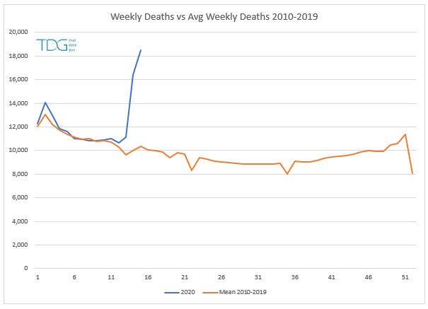
Comparing the latest data to the average of the 2010-2019 gives me the following:


Clearly the last few weeks (week 14 and 15 in government land) have bucked the trend considerably. But, we first need to check whether this is a fair comparison both in terms of trend and distribution.

If we look at the total deaths per year for the same period we get the following chart with a pronounced bump in number from 2015 onwards, so if we use all ten years, we might be creating a lower than expected average - after all, the population is changing both in terms of total people and average age, so we should reflect this by using more recent data.


Next, we can add some upper and lower bounds to get a feel for the data variability - here I've used a 95% confidence to help assess whether the most recent data represents a change, and clearly, now it does. Notice how by using the more recent data we can see the weekly deaths for weeks 3 to 11 were actually lower than normal (Daily Mail please take note, your charts are misleading).


So, clearly we have more deaths than would be expected in a normal year. So how many?

Well some of that comes down to the benchmark that we use. So here is by best (YTD) and worst case (weeks 13-15) scenarios:

The year to date scenario (YTD) looks at where we expect to be by the end of week 15 (week ending April 10th). Following a typical trend the UK would have reached 174K deaths, whereas we observe a figure closer to 185K. This gives an excess of 10,275 which is inline with the government figure at the time (9,288). This figure will not typically include non-hospital deaths (about 17%) and late reporting.

The ONS data for that period is fairly consistent again, however the ONS reporting is based on the date of death, not the date of reporting and these totals change as the deaths are registered retrospectively, so this figure changes from 10,335 reported on April 10th to 13,121 for the same period a week later. This shows no excess deaths other than those that might be expected for delays and non-hospital cases. However, this is a slightly flawed approach in that we are offsetting some of the increases against a lower death rate earlier in the year, which brings me to the second scenario based on just weeks 13-15.

Here we see a potential 15K increase in the weekly deaths compared to the previous five years and running through the same calculations it suggests taht 2K excess deaths for this period when compared to the final stats from the ONS. This means that the daily government figure of 9288 needs to be increased by 42% to attain the final ONS figures of 13121 (which could change again) and 62% too low compared with the potential excess deaths for the same period.

However, whilst in lockdown we may be causing a number of non-covid-19 deaths to occur when people stay indoors instead of obtaining medical help or in delays in getting emergency care. So 62% may be a bit too high. Therefore as a rule of thumb, we should probably take a figure somewhere between 42% and 62% to increase the level of deaths as a broad brush when starting with the daily stats from the government if we want to reflect delays in reporting and non-hospital cases. 50% seems like a good number to me.

Current reported deaths to date are for the UK 18,100 (DoH 22/4/20) this suggests the true figure is probably closer to 27,000. Which is not 41,000 being reported elsewhere,

Going forward we must be careful to not double-count these deaths if changes in reporting occur or catch-up figures are subsequently added in, otherwise we could end up with a huge estimate that bears no relation to reality.


Wednesday, April 22, 2020

London vs New York

Following on from my analysis of the UK regional infection trajectories, I wondered how London would compare with New York City (NYC) and whether there were any useful insight to be gained.

Now the problem with comparing cities in different countries is that you are dealing with different testing, recording and healthcare systems so any analyses produced should always be handled with a degree of caution.

Initially I started with some data on the total cases in NYC which when compared with London on my usual cases per 100K basis did not look right, so instead I have compared the London case data (typically confirmed in the hospital setting) with hospitalisation due to Covid-19 in NYC. This gives the chart below:


What we can see is that despite starting in quite similar positions on 11th March (high growth but low cases per 100K population) the curves quickly diverge - by 19th March NYC had more cases and nearly twice the daily growth rate (bearing in mind this is being compounded day-on-day at this point). This higher rate of cases and growth, meant that once the lockdown was triggered a higher trajectory for NYC was almost inevitable.

By early April this meant a plateau of 123 new cases per day per 100K population being hospitalised in NYC, nearly twice what was seen in London (67). Assuming a similar bed/population ratio in NYC to London, it's not hard to see how NYC was struggling to cope during late March early April - a rough estimate from this analysis suggests NYC would need over 10,000 beds in early April, compared to about 5000 beds in London at peak.


Update on post-plateau cases


Please see below the latest post-plateau comparison of new cases in selected markets. This uses the same methodology as my previous posts on the subject where the rate of new cases is indexed to 100% at the average peak value in each country. A few countries have the data shunted forward a day or two in order to make the patterns clearer. 


We still have the same underlying patterns appearing - countries with lower rates of infection seem to have declined faster, with those with a higher rates appear to be declining more slowly (although this may also be connected with the different strains of Covid-19 in circulation). This shape would be consistent with the 'fireman's helmet' shape that has been mentioned by the UK government - a rapid increase (classic exponential), a flat spot and then a slow decline in new cases.

If the UK is to follow the shape of the latter group then we are looking at a 40% decrease in new cases at 10 days after the peak, with hopefully a further drop of 20% of the original peak in the following ten days. The question still remains though, why hasn't the UK started to decline?

One factor we need to consider here is the level of new cases among key workers - this has become a sizeable component of new cases in the last week or so, and these pillar 2 cases as they are known appear to be offsetting any reduction in the level of new cases in the general population.

Here is the COBR slide from yesterday:


Looking at the stacked bar format it would appear to be a fairly consistent top-line number (both bars added together), with a hint of improvement in the last two days, although it's probably too early to tell. What is striking is the amount of new cases in pillar 2 in the last week, on April 20th this accounted for 35% of new cases and 20% of all new cases in the last 7 days. This additional source of new cases is definitely contributing to the delay of the decline of new cases. If we split the two pillars out (see below) you can start to see the early suggestions of a decline in the UK in pillar 1 (top chart) whilst the trends in pillar 2 is quite concerning - hopefully this contains some milder cases picked up earlier in the disease lifecycle and can be brought quickly under control. 

I am watching both these daily figures with interest.


I would like to point out that I am definitely not trying to assign any blame key workers at this point - by definition the are key workers that have to put themselves at higher risk of infection to do their jobs and save lives. They have my admiration.

Tuesday, April 21, 2020

Regional Trajectories

I've spent some time looking at some regional trajectories in the UK to get a better feel on where we are in the infection lifecycle at the moment. In my previous post it appeared that London was probably experiencing a decreasing rate of new cases and that the North East and North West were still in growth.

However, a simple snapshot of that type is not always that useful, what we need is a method of visualisation that allows a clearer comparison over time that combines several elements: rate of growth, level of infection (new cases per 100K population) and trajectory over time. This is one way we can represent this data. (You may want to click on the chart to see it full size).


The line shows the trajectory of new cases in the London area based on this government data. On the x axis we have the average daily growth rate of new cases, this is based on a rolling weekly value centred on the date shown compared to the same figure one week earlier. On the y axis we have the average weekly rate of new cases per 100K of the population and the line shows the evolution of these variables over time (date in dd/yy format as data labels). The data displayed cuts off a week ago, because the data feed is not fully up to date and has incremental cases added retrospectively. Based on the last week or so, the time periods shown are now unlikely to change significantly so I feel comfortable in publishing the data.

So, for London we need to start at the lower right hand side where we had relatively low levels of new cases (9 per 100K) but very high growth (33% per day is equivalent to about 600% a week). As time progresses the rate of growth slows (curve moves to the left) but the rate of infection increases (curve moves upwards), before peaking at 67 cases per 100K population in early April. Zero growth was achieved around 4th April and the rate of new cases has been declining ever since. As time moves on I now expect the curve to carry on downwards towards the lower left hand corner.

It's worth noting that this is new cases, and doesn't reflect the potential loading on the NHS at any point - this would give a flatter lagged curve that would not provide any insight into changes in the rate of new cases.

So, going back to my earlier point, how does this compare to the North East and North West regions, especially in regards to lag, loading and growth? Superimposing on those two regions gives the chart below. (I could have added all regions but I think we are rapidly approaching the point when you cannot see anything clearly).


Despite slightly different starting dynamics (growth was slower for the first few weeks, but still significant) all three regions show similar shapes. However, the North East shows considerably higher levels of infection and growth during the earlier weeks which probably led to a higher per capita case load at peak. 

Both the North East and North West start to plateau around April 4th - about 5 days after London, and a similar lag time can be seen before cases start to decline. 

The good news is that all three regions appear to have passed the peak of new cases and providing the local health services have coped so far, they should be able to manage going forward. This is one reason why looking at cases per 100K is so useful - not only does it allow a direct comparison of values, but if we assume that hospital bed numbers are roughly related to local population numbers, these comparisons should give a good proxy for hospital bed loading. 

One interesting note is how the shape of the London curve has a period of near constant (exponential) growth from 19/3 to 24/3, (seen as the curve being vertical), you could also argue there are similar vertical segments on the corresponding curves for the other regions around the same point in time. This time period was just before the formal lockdown began and when most people had started to work at home where possible - the change from vertical to sloping may indicate the impact of that first wave of working at home (curve starts to flatten on 25/3 for London) and the second impact of the formal lockdown about a week later (curve plateau starts 1/4 for London). We can only speculate as to what might have happened had these measures been in place a week or so earlier. 


Addendum:

By special request, please find below the equivalent charts for the South East and South West again compared with London. As expected we see much lower levels of growth and infection rates, with both regions just starting to decline (as of 13/4 data).


And for completeness:


Monday, April 20, 2020

Key Country Updates

United Kingdom:

The rate of new daily cases is still relatively flat with a slight upward trend. It appears that the UK regions may have plateaued in the last 7 days, so we could start to see a decline soon.  

Cases among the general public (Pillar 1) appear to be quite stable at about 4000, but we are now seeing rising cases among the key workers and households (Pillar 2). Pillar 2 now represents over 20% of new daily cases, thankfully these cases are based on more widespread swab testing, so hopefully will contain generally milder cases and therefore fatalities will be lower going forward.

Expect daily deaths to be in the range of  800-1000 for the next week and to cross the cumulative 20,000 point by the end of the week. 


France:

The long term trend for new daily cases (once I flatten out the spikes with some smoothing) is downwards, but this is very tough to model with any degree of certainty. The latest day available (19/4/20) is very low for new cases at 1101 on the back of 1909 two days before, which I hope is significant, but only time will tell. 

Daily deaths should continue to edge downwards and we may see a run of days below 500 per day soon.


Germany:

New cases are decreasing at a steady rate, dropping by 50% in about 9 days. There is a definite shift in the fatality rate (roughly half the previous level) starting on April 10th - the model has been updated to reflect this change.

Daily deaths should continue to fall between now and the end of the month and could be below 100 per day by the beginning of May.


Italy:

Italy is showing a slow and steady decline in new cases, but the fall is very slow at only 2.3% per day on average for the last few weeks. If this continues we can expect a long tail of cases in Italy.

Currently daily fatalities are falling but will follow the same pattern of slow decreases seen in the new case data.


Spain:

Very similar picture to Italy with an average decrease of 3.2% per day in new cases.

There has been a localised increase in new cases in recent days, hopefully this is just a blip (it's a bit early to be a consequence of relaxing some of the lockdown rules in Spain).

This is one country to follow closely for the next few weeks as it may prove a good model for the UK and other countries evaluating lockdown changes in the coming weeks.

Expect daily deaths to continue to fall and should average under 500 a day for the next week or so.


USA:

There was a large spike in daily deaths (3778) added to the data retrospectively on April 14th - these deaths related to the period March 13th to April 14th, so I have distributed the data accordingly to make the trend more representative.

New daily cases are now levelling off (although be aware that the latest couple of days are not always complete), this may continue for some time if it follows the same model as the UK, with some regions lagging behind others by a week or so causing offset local peaks.

The lag/fatality rate has been stable for four weeks now, so the model predictions should be fairly reliable - expect daily deaths to stay in the 2,000 per day range for the next week or so with cumulative deaths at about 60,000 by the end of the month.


Over the weekend the Daily Mail killed 1.85 million people

According to the Daily Mail, the worldwide covid-19 death toll reached 2 million over the weekend. Thankfully this was contradicted with the correct figure in the very next sentence. 

There's enough fake news going around on social media as it is, without the main stream media making such terrible journalistic errors - it just goes to show that it's worth having a healthy scepticism when consuming information at the moment and worth checking any strange numbers against several different sources to determine the truth. 


No Entry

Apologies to for the 'no entry' signs appearing in some of the posts. For some reason posts that were working perfectly normally are now refusing to display properly. 

I suspect I may be asking too much of blogger and have too much content on the home page so I am reducing the content on the main page.

Please bear with me I'm fixing these as time permits. . 

Friday, April 17, 2020

Areas of interest

I've been watching the plateau in the UK data for some weeks now and am eagerly awaiting the point at which the numbers will start to decline. So far we seem to be holding steady, which seems a little counter intuitive given everything that's going on.

However, we need to consider what is beneath the data, whilst I've been modelling the country as a whole, given the reduced amount of movement and human interaction it may be more meaningful to examine local areas since these will function more like isolated sub-populations which might be experiencing a different dynamic to the national aggregate picture.

Sourcing sub-national data is not as easy as I had hoped. There is data for England available here but the data tails off dramatically in the recent days and looks to report the data on the day the sample was taken (as opposed to reported as a new case) so it's not ideal, but in the absence of anything else this is where I started, but it does mean the latest day with reasonable looking data is 10th April - which is quite old given the current changes happening on a daily basis.

The first thing was to look at the data in classic English regions in terms of new cases per day per region (charts below). This was quite difficult to read because of the pronounced dips at the weekends and the general spikiness of the data (upper chart). Hence a second version was produced using a rolling seven day average (lower chart). Here we can see a few different patterns emerging, from London and the West Midland which appears to have peaked, to East of England which is flat to South West and South East which are still growing.


The net effect of this (some growing, some flat, some declining) is that overall level appears to be flat (see the stacked chart below), although underneath this headline we are starting to see some good trends emerging in some regions.


Looking into the data in more detail and incorporating population estimates (to give cases per 100K of the population) gives the chart below. This shows the weekly growth in new cases on the x-axis and number of new cases per 100K of the population on the y-axis by region. (Weekly growth compares new cases in week ending 10th April with week ending 3rd April).

Regions towards the left are declining, those to the right are still growing. Of particular concern here is the North East with high levels of infection (77 per 100K) and high growth 47%. Although, by way of balance, I should point out that these are very similar figures to those obtained for London one week earlier, so the situation here might have turned around already, but we wont know until the data catches up.


Drilling down to the next level (so-called 'Areas') gives a fairly unhelpful view of England (see below) where the grey bars show the national averages at the time of 15% growth and 47 new cases per 100K of the population. Those areas in the upper right quadrant are the areas of most concern (high infection and growing), lower left are next (low infection but growing) so could be a concern in a short while, whereas the left quadrants are flat to declining off a high base (upper) and low base (lower) respectively. It's worth noting that the lower left quadrant could represent a higher risk of reinfection in the future, but at the moment it's too early to tell.

With several hundred points we can see most permutations of growth and new cases per 100K population are occurring, but beyond that this kind of chart is not always that useful. So, instead let's examine the data in a different way. It's worth noting at this point that the reporting Areas used in the data are very different in size with some large counties having a population over a million and some reporting towns being in the 100,000 to 200,000 range, so comparing absolute numbers should be carried out with care.


By locking the chart axes we can now look at each region in turn and apply some simple 3 by 3 segmentation to the areas concerned to gain a better understanding.

So in alphabetical order, let us first look at East Midlands. This is mostly showing low infection rates with a mix of decline and growth with the only possible areas of high concern being Leicester and Nottingham. In general, this represent a good outlook for the next few weeks.


East of England - more mixed than East Midlands with concerns in Bedford and Luton now and possibly in Norfolk shortly.  


London is showing good signs of recovery almost everywhere, with plenty of reporting areas with declining rates of new cases. Many areas had high level of infection (per 100K population) but seem to be headed in the right direction now. Redbridge appears to be the only standout area of London with a High-High rating.


The underlying area data shows why the North East was the outlier on the regional chart and it appears that almost all areas show high level of infection and growth. There may be an underlying demographic reason here (high level of deprivation and smoking), irrespective of the cause, the data looks like new cases may grow for some time yet and put the local NHS resources under a very high strain. 


The North West has many areas in the High-High segments - similar to the North East there may be demographics underlying the numbers, but this case load and growth will continue to put pressure on the local NHS in the short term. 


The South East data is spread around several segments with Kent and Medway being causes for concern along with Oxfordshire. Portsmouth may be a potential growth area in the coming weeks. Interestingly the Isle of Wight has a very low incidence of cases which I assume is related to it's separation from the mainland.


The South West has seen fewer cases than most regions of the UK, however high growth in new cases in eight different areas might suggest a delayed peak of cases in the next few weeks. 


West Midlands - showing signs of recovery after being an early centre of infection during the outbreak. Most areas are now flat or declining.


Most areas of Yorkshire and the Humber and seeing below average levels of infection, many areas are seeing declining case levels, but there may be potential issues in some areas with Hull having the second highest week on week growth rate in England.


Overall it appears that the local areas of England are far from being in the same position in the infection lifecycle - while it is heartening to see large parts of the country (including most of London) in decline there is still plenty of areas (such as the North East and North West) that are yet to turn around and a large number of localities that could well peak in the coming weeks.

This localised time-lag effect probably explains some of the number behind the elongated plateau that we see at national level, however hopefully as the lockdown continues to limit the changes for the infection to spread we will see many more areas move both to the left and downwards on teh chart over the coming weeks